
I discovered Melissa Green via Twitter and was quickly drawn to her work in book design and construction. Her keen interest in economics further compelled me to reach out to her about participating in an interview. Here, she shares her mindful takes on the state of the printed medium and its most storied form—the book, her fascination with the handmade, and being a critical-thinking designer.
On being a designer, book maker, economics enthusiast
How did you arrive at the desire to become a designer? Was there an initial encounter of design-related work that played a role in your professional path?
I always liked doing art as a kid, but I never wanted to be a fine artist. I think it was partly because I didn’t think I would be good enough to make a living at it, and partly because fine art just didn’t interest me. I think what really convinced me to pursue design was this job I had the summer before I started high school. I was taking a creative writing workshop and our goal was to produce a small magazine by the end, but we ran out of time to put it together. The teacher asked me if I’d be willing to do it, and she basically put me in a room with a folder of handwritten pieces, some digital images of art done by other kids in the program, and a PC with PrintShop installed. It took me a week to organize, edit, type, and layout the whole thing, but at the end of each day, I didn’t even notice that time had passed. That was when it hit me that graphic design might actually be a viable career for me.
Your portfolio highlights the book. What makes the concept and object of the book enduring?
There is something about the totality of the book that I think makes it enduring. The fact that it exists in space as a whole object that holds content seems obvious, but I think it’s lost on a lot of people. The thing about web design, for example, is that you can customize the interface and branding until the cows come home, but it ultimately has to be viewed on some device that you have no control over—whether it’s a desktop, tablet, or mobile phone. The platform that delivers the content has some effect on the way the user experiences it, but in a way it’s sort of arbitrary. When you’re making a book, you have control over the design as well as the platform, because the book is its own platform. You control how big the pages are, the quality of the paper, the texture of the cover material. All of this influences the way the reader experiences the content and if you can define all of those variables, you get to define exactly how the object will exist in space.

Must ask: What is the state of the printed book? What is the state of the printed medium?
People have been saying for decades that print is dead, and yet it won’t seem to die. Actually, part of my reasoning behind naming my studio Graphosphere was that the word itself refers to the age of print, and I don’t think that age will ever truly be over. There are certain types of content that were published in print for a long time because it was the easiest way to publish things like romance novels and gossip magazines, for example. Those things will move away from print, because now it’s cheaper and easier to publish them digitally.
Now I think print is reserved more for content that people feel is important and want to be able to keep. It’s a conscious decision to publish in print, so I think that’s forcing people to think more carefully about what the medium has to offer and taking advantage of that. Also, with a printed book, you can keep that content on your shelf for as long as you want, and I think a lot of people still find comfort in that.
You’re doing a book project called “The Gutenberg Economy”, how did you become obsessed with economic theory as subject matter for designing?
It’s actually kind of a strange story … When I was in art school, I started to feel really isolated from world events, so I started watching the Rachel Maddow Show while I did my homework to keep up with the news. This was around the time that the Affordable Care Act was being debated in congress, and I remember there was one provision that Rachel had been talking about for a few days that I thought I understood, but realized on the third or fourth day that I was completely wrong. I was so internally embarrassed about misunderstanding, that I started doing intensive research about that provision to make sure I got it right. Somehow that ballooned into researching more about the bill, reading parts of it, following the debate in congress, watching the votes on CSPAN, reading daily commentary, the whole nine yards. After the bill passed, I felt kind of let down, because I would have nothing to do, so I started a similar process with the financial regulation debate. In the end, I left art school to go to a liberal arts college where I could learn more about public policy in addition to design.
What are some concepts, related to economy, that can be applied to designing?
To be honest, I have no idea. For the most part, my interest in economics influences the content of my work more than the process. Plus, the more I learn about economics, the more I think my design process should go in the opposite direction as quickly as possible. The Gutenberg Economy project actually explores how the discipline of economics is the result of increasing segmentation in human cognition as a result of print media. It tends to be so specific in its scope that it can be easy to lose sight of the bigger picture.
Classical economics is very much about analyzing people’s means and preferences and determining their optimal decision as a result. Once that’s figured that out, there are no other options. It’s not even a choice, it’s a calculation based on the assumption that all individuals are rational actors who will always make the decision that best meets their needs—or in game-theory terms, the decision that gives them the highest payoff. I think my first inclination is to think of design that way, because that’s how my brain works, but it’s also a very narrow worldview. Designing as if there’s only one solution means ignoring a lot of options that could actually lead to a better product, so I’m trying to shift my thinking in the opposite direction.
How do you define design?
I’m sort of partial to a definition of design that centers around problem-solving (as you might imagine based on what I just said about economics). Thinking about it that way makes me less anxious about having to create a work of art from nothing. If I have a defined set of parameters or objectives that everything hinges on, then I can ask myself a series of questions about how to get to a finished product. That’s much less daunting for me than trying to just sit down and make something. It also provides some answers about whether or not I achieved everything I intended in the final piece. That said, the problem doesn’t have to be like “end world hunger.” It could be as simple as making a wayfinding system to tell people where the restroom is.
What is design’s purpose or obligation in our society, the world?
That’s a tough question … and definitely one that I grapple with constantly. I don’t know if I have a direct answer, but I can tell you what I think a designer’s purpose should not be: designers shouldn’t be making more things for the sake of making more things. They should be thoughtful about the things they’re making and why they’re making them. The problem-solving approach can be helpful in figuring out why, which is important. Sometimes the goal is just to make someone smile, but knowing that is still key. As Mike Monteiro says in his book “Design Is A Job”, “you are responsible for what you put into the world.” Of course, there’s no ultimate arbiter of what work deserves to be made and what doesn’t, but I think people should make conscious decisions about whether or not they take certain jobs based on their own values.
Who and/or what are your design-related influences?
I’m heavily influenced by the New Typography and Jan Tschichold. My style has always been very clean and grid-based, but looking at his work has definitely pushed it more in that direction. At some point I came across Carlos Segura’s work, and for some reason, it stuck with me. A lot of it involved layering imagery, which was something I always wanted to do, but couldn’t make work at the time. As I’m finishing up my latest artist’s book, I’m seeing both of those influences coming through pretty strongly.
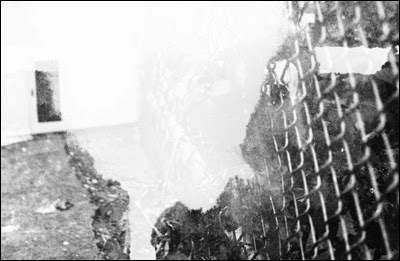
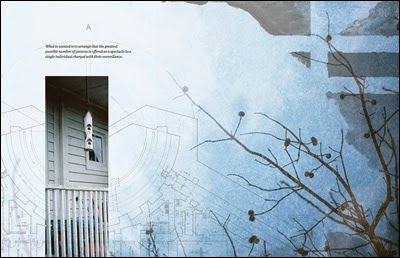
Image-layered compositions “Paranoiac Fantasy”
A lot of my inspiration also comes from other media. Most of my close friends are printmakers, including my business partner Josh Orr. Making things by hand is really important to me, and I love seeing a finished, printed product. A lot of my peers in the design think of printing as an afterthought, whereas printmakers love talking about print processes and paper, which is awesome.
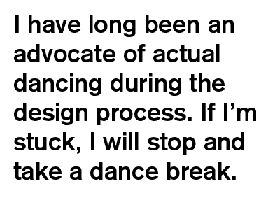
I’m also influenced quite a bit by people who write about design, like Mitch Goldstein and Frank Chimero. Mitch’s work is completely different from anything I’ve made (or probably ever will make), but he talks a lot about experimentation and the role of the design process in getting to the final result, which I’m trying to take to heart as much as I can. Along the same lines, in “The Shape of Design”, Frank compares the design process to dancing, which I think is very true. I have long been an advocate of actual dancing during the design process. If I’m stuck, I will stop and take a dance break. Luckily Josh is dancing most of the time anyway, so it works out.
How important is it for you to follow your instincts?
I would say it’s pretty important—especially when it comes to being flexible about how to work and meeting tight deadlines. I’ve had several conversations with friends about what happens when you feel like you don’t have as much time to put into a project as you’d like. I’ve found that once you reach a certain point in honing your skills and your craft, you can fall back on that. Often when I don’t have the time to rationalize every decision I make about every single aspect of a design, the decisions I make on the fly turn out to be on point. Or they will at least get me close enough that I can develop them more when I go back to refine.
Sometimes trusting my instincts has served better than trying to make something in a more controlled manner. There was this one t-shirt design that I’d been struggling with for days, and I’d tried a lot of different ways of rendering the figure more realistically and from different angles. I finally just did some rough sketches out of frustration, and in the end, realized that one of them fit my concept so I used it in the final design.
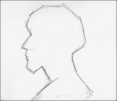
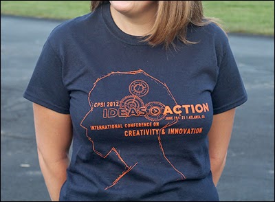
T-shirt sketch and design for CPSI Conference
Stemming from a recent discussion I had with new designers, is there a connection between a designer’s point of view and doing the work of a designer?
Inevitably, yes. Complete neutrality is sort of an impossible goal and doesn’t always lead to great work. This also goes back to the point about designers making conscious decisions about the work the choose to take on; if the designer cares about the work, that will hopefully come through in the finished piece. If the designer doesn’t care, there’s a good chance the work will reflect that too.
On creativity, design, working
Design writer Alissa Walker wrote an article called “Women in Industrial Design: Where My Ladies At?” Where are the Ladies in Design/Development/Strategy at?
God, I don’t know. I’ve been wondering this myself. A lot of times when I go to design events, I’m struck by the homogeneity of the crowd. I’ve been to a lot of design/development/content strategy lectures, conferences, exhibition openings, and parties hosted by a variety of organizations and studios throughout the city and, for the most part, the crowd is made up of white men. It’s actually kind of surprising given the diversity of the city. I think for me, it’s more an issue of race than of gender, though. I’ve gotten pretty used to being one of the only people of color in any given situation for most of my life, but even so, sometimes I can’t help walking in and thinking “Am I in the right place? Should I not be here?” My strategy is to just shake it off and keep showing up, but I still sometimes wish I didn’t have to do that.
How do you handle disagreements while you’re working?
It really depends who I’m working with and what the disagreement is about. Most of the time Josh and I are on the same page, but when we’re not, we can generally express our objections clearly enough to get to the underlying problem and find a solution we’re both happy with. If not, we’ll just set it aside and come back to it the next day, after we’ve had a chance to sleep on it.
It’s different if the disagreement is with a client. If it’s over the design itself, I usually explain my reasoning behind certain formal decisions, and a lot of times ,that’s enough to convince them. If that doesn’t work, I try to figure out what problem they’re trying to address by making something bigger or changing the color or whatever. Sometimes I’ll try their suggestions in secret and see if it does actually improve the design. If it does, I’ll keep it, and if not, I try to solve it another way. If they still don’t like, then that process repeats until we reach some kind of equilibrium or they run out of revisions in the budget.
What part of your work is particularly trying and how do you deal with it?
I remember at the beginning of my senior year of high school art teacher said “this year we need to work on getting you out of the idea phase and into the making phase faster.” I would have all these ideas for what I wanted to do, but then had a really hard time finishing my work on time (or at all). I think that’s still true today, but it seems like less of a problem now that I’ve learned how to manage it. At the time, most of what we were doing was drawing from life, so the fact that I was overthinking it was probably unwarranted. Now it just means that I put a lot of time into the research and concept development phase of a project, which is really important for me in creating good work. It lets me think through why I’m making something and establish goals for the end product.
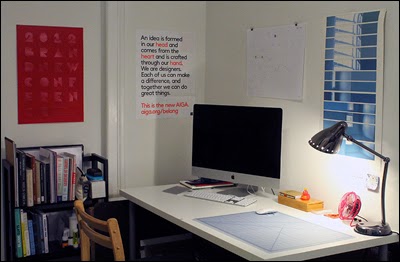
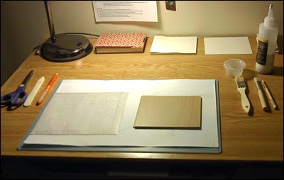
What is your workspace like? How does it contribute to doing the quality of work you want to do?
I recently got an iMac, which has been a lot better than working on my laptop. It’s little bit strange, though, because I can’t put it away. It’s always just there looking at me, but I’ve gotten used to it for the most part. I have a pretty big desk, so I can push the computer back and use the table to make books or assemble mock ups or whatever. I always try to clean off my desk completely before I start a serious book-binding project (clearing off all the junk, but also literally cleaning the surface of the table). It might be kind of neurotic, but I have a theory that a clean workspace leads to clean binding.
My favorite thing in my workspace is probably the sheet of test strips from the first artist’s book I ever made. It’s just color tests of from an inkjet printer on a 30-inch sheet of paper, but I hung it above my desk as a poster. It seems so banal, but it reminds me that making good work takes work (and time to sit next to the world’s slowest inkjet printer).
What tools do you use and recommend to work on ideas and make them grow, to collaborate and get things done?
My favorite thing in my workspace is probably the sheet of test strips from the first artist’s book I ever made. It’s just color tests of from an inkjet printer on a 30-inch sheet of paper, but I hung it above my desk as a poster. It seems so banal, but it reminds me that making good work takes work (and time to sit next to the world’s slowest inkjet printer).

What tools do you use and recommend to work on ideas and make them grow, to collaborate and get things done?
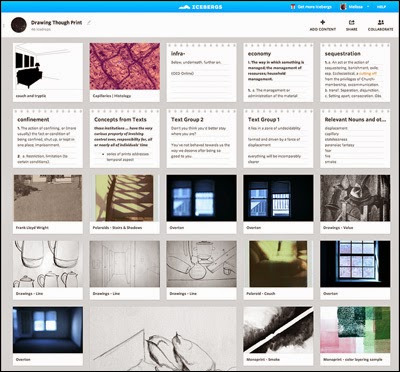
I use Icebergs (above) constantly. Whenever I start a project, the first thing I do is create an Iceberg for it. I’ll use that to collect my notes, ideas, research, inspiration, type specimens, and anything related to the project. Then as I start making things, I’ll sometimes upload some of the images that I think are working or encapsulate what I’m trying to with the project. That said, I usually hate actually coming up with ideas at a computer, so I’ll just grab a sheet of scrap paper (or a notebook if I’m being smart about it) and write about what I’m trying to do or make a list of ideas. From there, a lot of times I will go to the Oxford English Dictionary online to look up definitions for words that are relevant to the project. A lot of times the wording of the definitions can help me clarify what I’m getting at, even if I already knew what the word meant.
In terms of collaboration tools, Josh and I use Flow and Podio quite a bit. We use Flow to assign and track tasks and then Podio for general project updates, meeting notes, files, and cute drawings from Exploding Dog. A lot of times we’ll just sit on the couch and talk through ideas or do it over the phone if we’re working remotely. Scrap paper also comes into play quite a bit in those instances.
How do you stay creative? What are some of your sources of motivation/inspiration?
I’m always thinking about the projects I’m working on and actively assimilating unrelated information into them as I come across it. I could be reading about game theory and thinking about how those ideas could relate to the book I’m making. Or I could be looking at the menu at a restaurant and thinking about how the information is organized and how I might want to use a similar structure in the future. As with critical making, I thought this was something that everyone did, but I’ve learned over the years that a lot of people just don’t pay attention. Or, if they are paying attention, but they just sort of let things wash over them without thinking about them. Thinking about what’s going on around me is key.
What is your definition of bad design?
As I mentioned before, I think the question of appropriateness is key in design. There are some styles I’m not particularly fond of formally (read: post-modernism), but I wouldn’t say they’re bad. Bad design to me is inappropriate for the context.
If you were asked, “Melissa, I want to be a designer?” What’s your response?
I’d probably say “Sweet! Do it!” But I might also ask them why. I’ve met a lot of people who want to be fine artists, but go into design to make money. I’m puzzled by this, because they’re so obviously unhappy and make mediocre design work, and yet are fantastic at photography or painting or whatever. Plus it makes them happy! I would just say don’t force it if you don’t really want it. If you’re just going through the motions, it will be obvious in your work.
Any other aspects of your work that would be interesting to creative practitioners and aspiring product/business makers?
Recently I’ve been thinking a lot about community-building and collaboration. I have gotten really good at seeking out people who can help me push my work further. Just like I’m constantly thinking about how ideas or styles could be integrated into my work, I think a lot about how people I meet could become collaborators or at least be helpful in giving feedback—especially people who have similar interests, but different skill sets. That’s a big part of why I wanted to start Graphosphere. Josh and I have a lot of the same values when it comes to making, but our approaches can be completely different. Before starting the studio, we would help each other on a lot of projects, exchanging ideas or giving feedback, and the result of our joint effort was generally better than just one of us individually. I guess I would say that working with other people can be really helpful—even if you can go it alone. I know everyone is scarred from terrible group project experiences in school, but if you pick your team wisely, great things can come of it.
How does New York contribute to your work? And what makes it special for startups/business/creativity-at-large?
For me the best thing about being in New York is getting to see design in context. It’s one thing to see photos of a project on a design blog, but it’s a totally different experience walking down the street and just seeing an awesome campaign on the street or walking by a restaurant with great branding. (I’ll be honest, I am known to go into places like that just to see how the branding is carried out throughout the different parts of the experience.) I also go to a lot of AIGA events here, which is fantastic because the city is so saturated with talented designers. Hearing them talk about their work and then later spotting it on the street is an experience I don’t think you can get anywhere else. I think that sort of feeds me creatively and pushes me to want to make more.
• • •
All images courtesy of Melissa Green.
• • •
Typeface of quotations is Akzidenz Grotesk designed by Günter Gerhard Lange.
• • •
Read more from Design Feast Series of Interviews with people who love making things.
❤️ Donating = Appreciating: Help keep Design Feast going!
Lots of hours are put into making Design Feast—because it’s a labor of love to provide creative culture for everyone through hundreds of interviews, including event write-ups. Please consider becoming a supporting Patron with a recurring monthly donation.
Visit my Patreon page where you can view my goals and reward tiers—starting at $1 per month. Starting your patronage today matters—it’ll help Design Feast remain available, even grow.

