
Photograph by Oksana Karle of Karle Design & Photography
Complementing her Blogger’s Quest(ionnaire), Amy Marquez (with family above) generously expands on thoughts about her discipline of user experience design, from good examples to tools. She also shares her passion for improv and her take on women in design and technology.
Where are you from?
San Antonio, TX > Studio City, CA > Huntington Beach, CA > Phoenix, AZ > San Antonio, TX—So, San Antonio, with about a 9-year break to explore the Southwest.
What does design—the noun and verb—mean to you?
What does design—the noun and verb—mean to you?
Design, the noun, is the structural foundation and aesthetic decoration of a particular thing. I think of the overall term “design” like I would think about the architecture of the Florence Cathedral. Beautiful on the surface, but incredibly complex underneath.
To design (verb) is to consider all the disparate elements of something and bring them together in a way that is easily comprehended and utilized. For me, it’s as much an exercise in logic as it is a creative endeavor.

As a user experience designer, what is user experience design, and when did you think it became visible as a discipline?
To design (verb) is to consider all the disparate elements of something and bring them together in a way that is easily comprehended and utilized. For me, it’s as much an exercise in logic as it is a creative endeavor.

As a user experience designer, what is user experience design, and when did you think it became visible as a discipline?
At the heart of it, user experience design is the act of telling an aesthetically pleasing story. If your story rambles or is unclear, your user gets lost and your experience has failed. If the aesthetics of your story are jarring, it’s an unappealing story.
UX design has been around for a while, but I think it’s visibility skyrocketed when Apple launched the iPad. Suddenly everyone was talking about “intuitive user experience” with the iPad. Executives started saying “we need to have a good user experience”, whether or not they knew what that meant.
When did you start your focus on user experience design? How did you turn this focus into your current career path?
My experience with design started in the theater. I have a BA and MA in theater and did a lot of set design and makeup design, along with designing programs and posters for shows.
But my fascination with layout started with a part-time job at The Battalion, the Texas A&M University school newspaper. I did some of the advertising layout for the paper.
In the late 1990s, I moved to the Los Angeles area to pursue a job in the entertainment industry. While working for a special effects company on some simple photographic enhancements, I was tasked to learn about this “web” thing and help the company build a web presence. From the first HTML tutorial I took, I was hooked. From that time forward, the only jobs I took were UX design related.
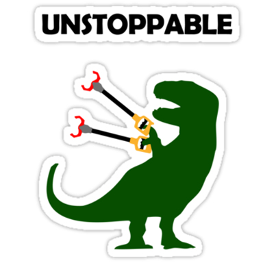
Sticker from Redbubble—How Amy feels with the right tools
Are there user experience designers/design groups you look up to? Who?
But my fascination with layout started with a part-time job at The Battalion, the Texas A&M University school newspaper. I did some of the advertising layout for the paper.
In the late 1990s, I moved to the Los Angeles area to pursue a job in the entertainment industry. While working for a special effects company on some simple photographic enhancements, I was tasked to learn about this “web” thing and help the company build a web presence. From the first HTML tutorial I took, I was hooked. From that time forward, the only jobs I took were UX design related.

Sticker from Redbubble—How Amy feels with the right tools
Are there user experience designers/design groups you look up to? Who?
I absolutely love the design and usability professionals who write and present for UIE. I organize the training for my design team, and we always enjoy their virtual seminars. And anyone who’s seen Jared Spool speak at a conference can vouch not just for the quality of information in his presentations, but for how dynamic and interesting Jared is to listen to. I also enjoy Cennydd Bowles’ blog posts. He covers some of my favorite topics.
What are examples of good user experience design and why?
What are examples of good user experience design and why?
Good user experience design takes content and context into mind across channels (a channel being a delivery method to the user—like mobile, tablet, web, etc.). I talk about a great example of this in an opinion piece I wrote for .net Magazine. I know holding Amazon up as a bastion for excellent experience design is a little cliché, but it’s absolutely valid. On each platform they deliver to—web, mobile web, iPhone, iPad, Android, Kindle, etc.—they know exactly what their customer’s priorities are in each setting and design to that.
Another part of good UX design is making the content the star, not the designer. When a design is simple and clear and stunning, and the product and content is front and center (see heymosaic.com for one of my personal favorite examples), and can still employ the latest design trends and techniques, I’m impressed. It’s really a difficult balancing act to make a usable, beautiful design without crossing over into showboating.

What sources do you recommend to learn about user experience design?
Another part of good UX design is making the content the star, not the designer. When a design is simple and clear and stunning, and the product and content is front and center (see heymosaic.com for one of my personal favorite examples), and can still employ the latest design trends and techniques, I’m impressed. It’s really a difficult balancing act to make a usable, beautiful design without crossing over into showboating.

What sources do you recommend to learn about user experience design?
Every book that A Book Apart offers should be at the top of the reading list. Designing for Emotion by Aaron Walter is one of my favorites. Another great book for beginning designers is 100 Things Every Designer Needs to Know About People by Susan Weinschenk. It’s very much about the psychology of why people see things the way they do. It’s also a fast read and is formatted so that it’s in easily digestible chunks.
You have experience in the theater and keep up your passion with improvisational comedy. How do these disciplines influence your design work?
You have experience in the theater and keep up your passion with improvisational comedy. How do these disciplines influence your design work?
I can’t tell you how wonderful it is to be able to think on my toes at any given moment. Improv really puts your brain in hyper-drive. I feel more inspired and innovative in brainstorming sessions because of the work I do with improvisational comedy. It just exercises “outside the box” thinking and helps me bring that into my work.
There was a period of about 4 years that I didn’t do improv because I was raising two toddlers. When I returned to the stage, I felt like my brain was in a sludgy fog in comparison with the other performers. But after just a few weeks back in the saddle, the quickness returned.
It also forces me to keep up with current events. You have to know what’s going on in the world so you can poke fun at it. I read most of my news on Flipboard, so I can keep my design and tech-related reading and current events reading in the same place.
How do you manage being both a full-time designer and a proactive improvisational comedian, in addition to being both a wife and mother? Because there are a lot of people out there who have passions outside their day job.
There was a period of about 4 years that I didn’t do improv because I was raising two toddlers. When I returned to the stage, I felt like my brain was in a sludgy fog in comparison with the other performers. But after just a few weeks back in the saddle, the quickness returned.
It also forces me to keep up with current events. You have to know what’s going on in the world so you can poke fun at it. I read most of my news on Flipboard, so I can keep my design and tech-related reading and current events reading in the same place.

How do you manage being both a full-time designer and a proactive improvisational comedian, in addition to being both a wife and mother? Because there are a lot of people out there who have passions outside their day job.
I get that question a lot. People ask me how I have the energy to do it all. Most days it doesn’t really seem like too much to me. It’s all about knowing what your priorities are. And what’s great about that is that my family, design and improv are all passions of mine. I get to make my favorite things my top priorities. I think there are a lot of people who don’t have a chance to do that in their daily grind.
I do have to be very careful and pay attention to keeping balance. I spend as much time with my kids as I can. I sit down with them and help with homework, I present at Career Day, we go to museums, the zoo, the beach, as often as we can. Sometimes the house is a little messier than what I’d like. Like many working moms, I’ve had to learn what I can let go of until the weekend.
But that’s also where having an amazing husband comes in. The rule for dinner time is whoever gets home first cooks. So, if I’m running late at work, he gets dinner going. (And he’s a fantastic cook!) If I have an evening improv show to get to after dinner, he makes sure the kids get bathed and put to bed. And if I’m away at a conference, he does it all. We truly are partners in our relationship, and that’s what makes it all work.
Writer Alissa Walker wrote an article called “Women in Industrial Design: Where My Ladies At?” Where are the Ladies in Design/Development/Building/Strategy at?
This is a really important topic to me. I’ve seen a little growth in the number of women in design and development, but not nearly as much as there ought to be.
One recent article in Forbes magazine suggests that the reason that there aren’t more women in tech is that “We simply do not have enough women choosing tech careers.” The author says that women seem to be uninformed about the variety of tech jobs out there. As much as we like to ignore gender bias, most girls are still raised to believe that nurturing careers like nursing and teaching (noble in and of themselves) are the best for women, and that tech jobs are boring and left-brained only. There needs to be more done at a grassroots level to educate young girls and women entering into college about their choices.
That being said, there are some amazing prominent women in user experience design. Karen McGrane, Whitney Hess, Sarah Parmenter, Kim Goodwin, Dana Chisnell, to name just a few.
What is your definition of bad design?
One recent article in Forbes magazine suggests that the reason that there aren’t more women in tech is that “We simply do not have enough women choosing tech careers.” The author says that women seem to be uninformed about the variety of tech jobs out there. As much as we like to ignore gender bias, most girls are still raised to believe that nurturing careers like nursing and teaching (noble in and of themselves) are the best for women, and that tech jobs are boring and left-brained only. There needs to be more done at a grassroots level to educate young girls and women entering into college about their choices.
That being said, there are some amazing prominent women in user experience design. Karen McGrane, Whitney Hess, Sarah Parmenter, Kim Goodwin, Dana Chisnell, to name just a few.

What is your definition of bad design?
Bad design is usually a sign that the design team neglected to consider use cases and left out usability testing.
If the users eye doesn’t know where to go on a page (no visual hierarchy), you’ve lost them. Poor navigation, unclear calls to action, elements not behaving as the user expects them to, lack of content prioritization or cohesiveness in messaging—these are all hallmarks of bad design. The average person doesn’t realize that content is a huge part of design.
Bad design is also not taking context into account. There’s this trend of a pretense at responsive design by basically reformatting a business‘ website and throwing it all, kitchen sink and all, on the mobile version. This ignores the context, the environment in which the user is accessing a business’ website.
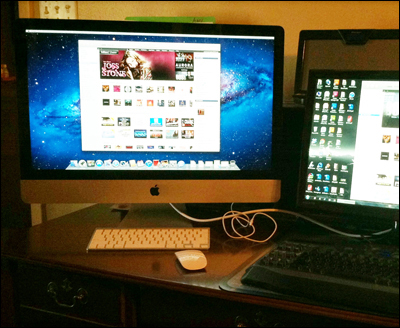
Amy’s home set-up. Originally a Windows user, but as Amy put it, “Once I went Mac, I never went back.”
How does time factor into your work?
If the users eye doesn’t know where to go on a page (no visual hierarchy), you’ve lost them. Poor navigation, unclear calls to action, elements not behaving as the user expects them to, lack of content prioritization or cohesiveness in messaging—these are all hallmarks of bad design. The average person doesn’t realize that content is a huge part of design.
Bad design is also not taking context into account. There’s this trend of a pretense at responsive design by basically reformatting a business‘ website and throwing it all, kitchen sink and all, on the mobile version. This ignores the context, the environment in which the user is accessing a business’ website.

Amy’s home set-up. Originally a Windows user, but as Amy put it, “Once I went Mac, I never went back.”
How does time factor into your work?
It depends on the projects. Right now I’m working on a large-scale project where we have a fair amount of time to conduct research, do mind mapping, build out use cases and hold design studios. It’s fantastic. I really enjoy working this way.
Other times, I get projects with a due date of “yesterday!” and it’s a big rush with lots of overtime to get everything done. I work well with tight deadlines, too. Though it’s always nice to have a pace set that doesn’t require too much overtime.
Regardless of the speed of the effort, it’s really important for me to work closely with my project team and keep our priorities aligned. That helps to set expectations and keep timelines on track.
How do you handle disagreements while you’re working?
Part of being a UX designer is being a really good listener. When there are disagreements, I listen carefully to what is being said and restate my understanding of what was said. Often times, we’re saying the same thing—working towards the same goal—but just expressing ourselves differently.
Was there a part of your work that was particularly trying, and how did you deal with it?
Was there a part of your work that was particularly trying, and how did you deal with it?
Early on in my career I worked for a .com startup. The executive management apparently had very questionable ethics and asked me to do things with design that I felt was plagiarism. I dealt with it by being up front with my manager about the situation and telling her that I would not do what the execs were asking. She went to bat for me, but was told to follow orders. I turned in my resignation and started looking for other opportunities.
What tools do you use and recommend to work on ideas and make them grow, to collaborate and get things done?
What tools do you use and recommend to work on ideas and make them grow, to collaborate and get things done?
My best tool is empathy. After establishing that, sketching with a variety of pens on paper is a really great way to start working out design concepts. I highly recommend conducting mind mapping sessions and design studios. It’s like organized brainstorming that ends with a really good idea of where the project or design is going.
After the paper sketching, I usually move straight into Photoshop. I really like the look and feel of Balsamiq because you can give the business an idea of what the design will be without setting anything in stone. But I find that I personally work faster in Photoshop. I’ve just been using it for so long that it’s my go-to tool.
Outside a corporate setting, I’ve found Google Docs and Google Drive to be great ways to collaborate and share with others.
You definitely stay creative through your improv work. Are there other sources of motivation/inspiration that you tap into?
My children are a constant source of inspiration and motivation. They are such brilliant young things. The way they look at the world fascinates me. Sometimes if I’m working on a project at home, I’ll ask their opinion on a design element or iconography and they’ll come up with amazing insights.
I’ve also started writing quite a bit. I started a blog in September 2012, and have published three articles for .net Magazine and UX Booth. My mom was a prolific freelance writer—I learned quite a bit from her. It’s comforting to me to have writing as another outlet. I feel like I have a connection with her even though she’s gone.
What is your advice to people who aspire to be a creative practitioner?
I’ve also started writing quite a bit. I started a blog in September 2012, and have published three articles for .net Magazine and UX Booth. My mom was a prolific freelance writer—I learned quite a bit from her. It’s comforting to me to have writing as another outlet. I feel like I have a connection with her even though she’s gone.

What is your advice to people who aspire to be a creative practitioner?
That’s the key word right there—practitioner. It’s all about practice and sticking with it. If you enjoy something—whether it’s drawing, photography, designing—do it. And keep doing it. And don’t stop doing it. Learn everything you can about it. Read books, read websites and blogs, read magazines. And while your learning, practice what you’ve learned.
And never let anyone tell you that you can’t be or do something. The only person that gets to set your limits is you.
What is your advice to people who aspire to be a user experience designer?
And never let anyone tell you that you can’t be or do something. The only person that gets to set your limits is you.
What is your advice to people who aspire to be a user experience designer?
If you want to be a user experience designer, you have to start with a rudimentary understanding of what your own design skills are. If you’re serious about design, you’re going to need some good software, too. You don’t absolutely have to have the entire Adobe Creative Suite, but Adobe Photoshop is still one of the most widely used graphics programs out there. For learning code, you can use SublimeText 2. It’s a great program and only costs $70.
If you haven’t already, take some beginning graphic design courses and HTML courses. You can do this online at Lynda.com or Treehouse.com. Or there are free tutorials out there as well.
And find a mentor. Connect with local UX professionals if you can.
How does San Antonio contribute to your work? And what makes it special for startups/business/creativity-at-large?
If you haven’t already, take some beginning graphic design courses and HTML courses. You can do this online at Lynda.com or Treehouse.com. Or there are free tutorials out there as well.
And find a mentor. Connect with local UX professionals if you can.

How does San Antonio contribute to your work? And what makes it special for startups/business/creativity-at-large?
I moved back to San Antonio about five years ago when my mother became very ill. After a prolonged battle with heart disease and other complications, she passed away this past October (2012).
Coming back to San Antonio as an adult (when I left I was in my 20s, and I still felt like a kid) gave me a whole new appreciation for the city.
You may be familiar with the Austin slogan “Keep Austin Weird”. The San Antonio slogan is “Keep San Antonio Lame”. Well, as a married adult with two young children, lame is awesome. The schools are good, the neighborhoods are nice, and San Antonio is one of those cities that has never really suffered when the economy is suffering. When the housing bubble burst, San Antonio was basically unaffected by it.
It’s a stable environment to raise a family in. It has power house large companies and industries (health care, tourism, military, insurance, financial, petroleum) that provide constant job opportunities.
Where I think it could improve is in the creativity. San Antonio isn’t a city that has a booming arts or music scene like Austin does. It’s a much slower-paced city. I think some people refer to it as the biggest small town in Texas. The official population is about 1.5 million. But it still feels like small town America. What that means for the creative industries is that there’s not as much patronage of the arts here.
All images courtesy of Amy Marquez.
Typeface of quotations is Cooper Black (1922) designed by Oswald Bruce Cooper in Chicago.
• • •
Read the Blogger’s Quest(ionnaire) with Amy Marquez.
• • •
Read more from Design Feast Series of Interviews with people who love making things.
Coming back to San Antonio as an adult (when I left I was in my 20s, and I still felt like a kid) gave me a whole new appreciation for the city.
You may be familiar with the Austin slogan “Keep Austin Weird”. The San Antonio slogan is “Keep San Antonio Lame”. Well, as a married adult with two young children, lame is awesome. The schools are good, the neighborhoods are nice, and San Antonio is one of those cities that has never really suffered when the economy is suffering. When the housing bubble burst, San Antonio was basically unaffected by it.
It’s a stable environment to raise a family in. It has power house large companies and industries (health care, tourism, military, insurance, financial, petroleum) that provide constant job opportunities.
Where I think it could improve is in the creativity. San Antonio isn’t a city that has a booming arts or music scene like Austin does. It’s a much slower-paced city. I think some people refer to it as the biggest small town in Texas. The official population is about 1.5 million. But it still feels like small town America. What that means for the creative industries is that there’s not as much patronage of the arts here.
• • •
All images courtesy of Amy Marquez.
• • •
Typeface of quotations is Cooper Black (1922) designed by Oswald Bruce Cooper in Chicago.
• • •
Read the Blogger’s Quest(ionnaire) with Amy Marquez.
• • •
Read more from Design Feast Series of Interviews with people who love making things.
Thanks for reading so far this Design Feast interview.
Read this full interview and more by supporting Design Feast on Patreon. If you’re able to, please become a Patron of Design Feast today from $1 and up—it only takes a minute. Your monthly contribution will give you full access to this interview and those upcoming with extraordinary creators and their perspectives. Stay both informed and inspired.

What will stay free to completely explore at Design Feast are the 346 insightful interviews with an incredible range of Designers, Bloggers, Makers and realizers of Side Projects.
