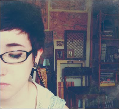
Fascination and respect for nature and its history are intrinsic to Teagan White’s art and design. The attention given to nature’s language also extends to artifacts and mortality, and these realities converge in White’s visual storytelling.
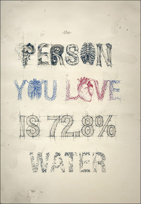
In fact, the boundary between graphic design and illustration is rendered extinct in White’s work. Here she shares her thoughts about being a designer and illustrator, striving to remove the perceptual division between the two disciplines, and, at the same time, drawing the depth of beauty inherent in the world in more ways than one:
Can you please tell a little bit about yourself?
Where are you from? What do you do for a living?
I’m a 20-year old illustration student at the Minneapolis College of Art & Design (currently in my junior year). I grew up in Chicago, which I love and miss, but I’ll probably stay here in the cold but lovely Twin Cities after I graduate.
Most of my attention is devoted to schoolwork, but what time I do have to earn money is divided three ways between freelance design and illustration jobs, sale of artwork and prints, and my work-study job on campus where I tutor other students in software and writing. I hope to make a living on the first two alone eventually.
What is your statement about being both a designer
and illustrator?
I honestly never set out to be an illustrator—I just sort of fell into it. I’ve spent a good portion of my life simply trying to make things look better, or to highlight things I find beautiful, for no other reason than my own enjoyment of them. This eventually led me to drawing and then designing, and when I started posting the things that I made online and people seemed to like them, the rest grew from there organically. My approach to it at this point is still pretty much the same. There are so many beautiful ideas and visual experiences in this world, and in some ways, creating work is a way for me to collect and catalog the best of them, and share with others my perspective in life.
What do you mean by the “perceived gap between
graphic design and illustration” and how are you closing
this gap?
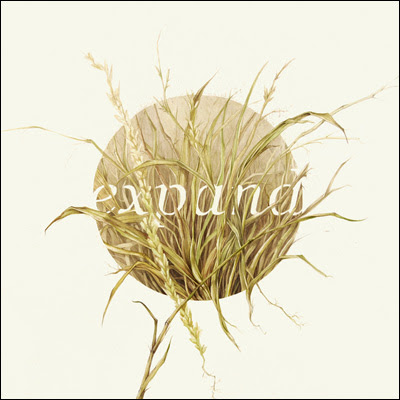
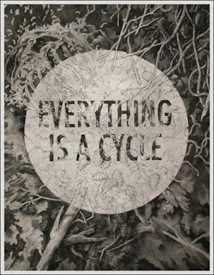
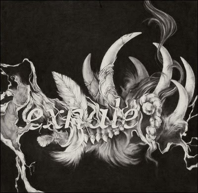
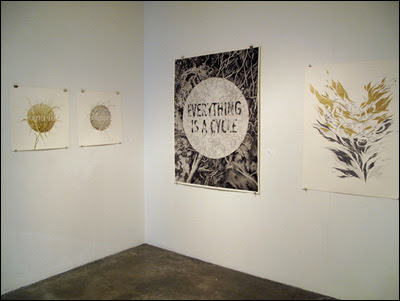
This is a concern of mine partly because, as an art student, I’m limited every day by the necessary division of creative fields into different majors. It can be a struggle to take assignments that are biased towards certain styles and subject matters and turn them into something that’s relevant to the type of work I want to be producing. I think the separation is less severe in the professional world, but the mindset is still prevalent, that graphic design should look one way, illustration another, fine art another… While these definitions are practical on many levels, on others, they are stifling to the growth of every industry. Personally, I don’t see any good reason why an image made in InDesign shouldn’t find its way onto a gallery wall, and one made in paint can’t be used in corporate branding, but these are not commonly considered options. In my own practice, ignoring these perceived boundaries leads me to many results I find exciting, such as the incorporation of typography and graphic layouts into large-scale charcoal drawings. I try to sample only my favorite parts of each field—taking the progressive mindset of a graphic designer without the sterility of execution, the hand-made techniques of an illustrator without the burdens of characters and settings, and so on.
What tools and materials do you use to work on your ideas
and make them grow?
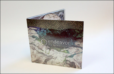
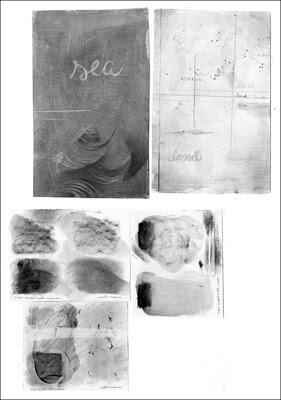
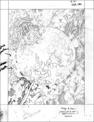
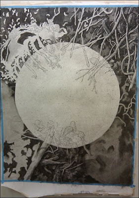
I always start out a piece with a series of sketches, although I really dislike that stage. It’s enormously important, though, as it helps plan the composition and make other choices early on so I don’t run into problems later. But I prefer to move on as quickly as possible to the final image (see progression below), which I can engage more fully with in terms of materials and detail and subtleties. Lately, since I’ve been focusing on traditional mediums instead of working digitally, some type of material study usually comes before I can start on the final, and those can be a lot of fun. My favorite materials lately have been charcoal (both dry and wet), graphite and watercolor.
What makes “natural history, antiquities, and mortality”
as particular influences on you and your art?
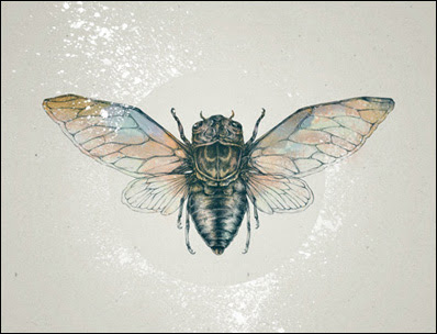
This comes back to the act of collecting the things. I’m drawn to and involving them in my work. The work of any good designer, illustrator, artist, photographer, whatever, is usually at its core, an expression of the individual creating it… All the complexity and richness of a human life boiled down to one image that will never do them justice, but it’s a start. In my day-to-day life, I’m drawn to things that look or feel a certain way, and the quoted words are my main attractors. I adore every detail of the natural world, especially plant life and soil and changing seasons; I also am drawn to antiquated man-made objects, anything that you’d describe as “old-fashioned”. I collect them whenever possible, so it’s not surprising that the worn look these things have finds its way into my illustrations as well. Finally, mortality fascinates me from what I guess you could call a philosophical perspective… With my love of nature comes an appreciation for the way that living things are disposed of after death, with such grace and efficiency, that it’s puzzling to me why so many people fear death and are soothed by the idea of an afterlife. My recent work explores decomposition and life cycles in general with the hope that my reverence for the subjects might rub off a bit on my viewers.
How does time factor into your designing and illustrating?
I’m constantly racing against the clock. Between school, work, freelance, day-to-day life activities, and spending as much time as possible with my boyfriend, I don’t really get a chance to have hobbies, or read the ever-growing stacks of books I’d like to get through. But it’s nothing to complain about—I’m enormously lucky to be able to make money doing what I love, and I’m content with my busy life. The time involved in creating work, with the amount of detail mine has, makes it a labor of love, and that’s always going to be worth the accompanying stress and sleepless nights.
What is the most rewarding part of being an illustrator?
I like that I get to be my own boss. There’s no guy with a superiority complex to answer to, and no one to blame but myself when I fail. I don’t like dealing with authority figures, and clients generally treat you as an equal and with respect—they’re hiring you because they like your work, after all. I can choose which jobs to accept, which makes my future alive with possibilities and variety and potential growth. I can’t think of anything worse than being stuck in a career where I perform the same tasks time and time again without any progress in sight.
Was there a part of your work that was particularly trying
and how did you deal with it?
Being in school is difficult at times. I love MCAD and am enormously grateful for everything I’ve learned so far, but there are times when I get very frustrated by assignments with burdensome requirements (it’s difficult to major in illustration when you don’t want to put people or characters in your work) and time restrictions which don’t allow me to be as ambitious as I’d like to be. I’m also constantly flip-flopping between wanting to major in illustration and wanting to major in drawing & painting, neither of which fully encompass my practice, so I make do with taking plenty of classes in both areas. My instructors tend to be supportive and understanding of my perspective, which helps things.
How do you stay creative? Do you draw?
Or keep a journal?
I wish I could say I kept a sketchbook, but unfortunately, I’ve never been able to get into keeping one. I think the biggest reason for that is that I spend enough time in my life drawing, and would rather stay creative by branching out in other directions. Instead, I take a lot of photographs, and make a lot of lists. These are the things I come back to when I’m out of ideas, or even just to improve my mood. They’re sort of just secondary ways to remember things that I experience and want to hang on to, but in some ways they become art forms in themselves, if only for my own enjoyment.
What are some of your sources of inspiration?
I keep my eye on certain websites a lot for ideas—DeviantART and Behance especially. There are also a handful of artists who I completely idolize: Andrew Wyeth, Krzysztof Domaradzki, Matthew Woodson, Sam Weber, and Alex Kanevsky, to name a few. I’m also lucky to have talented friends who I can look to for inspiration and bounce ideas off of. Beyond that, literature is a big influence for me, especially work by JD Salinger and Jonathan Safran Foer.
What is your advice to people who aspire to be
a designer and illustrator?
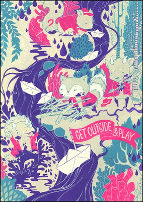
Let your work be an expression of who you are, not what you think someone wants to see, or a replica of someone else’s style that you think is good. It takes time to develop your interior nature into an external expression that other people will appreciate, but when you get there, it will be more powerful and rewarding than an imitation, which will always ring empty.
How can people see your work and buy it?
Website: teaganwhite.com
Behance: behance.net/teaganwhite
DeviantART: lostsoulx44.deviantart.com
Buy prints, t-shirts, skins, etc.: society6.com/teaganwhite
For purchasing original work, email: teaganwh@gmail.com
• • •
Read more from Design Feast Series of Interviews
with people who love making things.
Please consider supporting Design Feast
If you liked this lovingly-made interview, show your appreciation by helping to support my labor of love—Design Feast, which proudly includes this blog. Learn more.
