
My regular tool is a ballpoint pen. But I recently began using a marker—a Sharpie to be exact—in sketching user interfaces, as recommended by UI-Patterns.com’s Anders Toxboe and 37signals’ Jason Fried. At first I didn’t think that the thickness of each drawn stroke would matter, but it does.
Using a marker, which has a more substantial feel in your hand compared to a slim pen, helps make more decisive marks on paper, whether those marks constitute a wireframe, a page layout, a floor plan, a letterform, etc. And the weighty line can emphasize clarity of thought or expose the gaps in visualizing a concept.
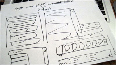
An opportunity for vetting the marker’s merits came up recently, while discussing a user interface design with a co-worker. We used a marker to quickly render notions for a different screen layout. The contrast of the sketches helped guide discussion. Within a few minutes, we rendered another possible screen layout. The third and last sketch proved to be the most viable solution, which was then refined digitally.
The conclusion is not that markers keep to the big picture and fine-point pens hone in on the details. As a collaborator of mine said at the Getting Mobile App Real blog, “Don’t sweat about the tools.” Rather, it’s the importance of using what is comfortable to you. When it comes to sketching user interfaces, using a marker was an effective discovery. Of course, thinking is what always makes each bold mark count.
• • •
A version of this piece was also published at the blog of custom software developer Pathfinder Development.