
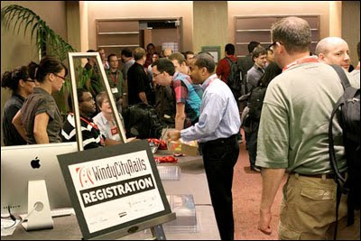
Photo by Rob Lambert
In contrast to the developer’s language of code and software frameworks is the designer’s language of typography and information visualization. One session at the Windy City Rails 2010 conference that piqued my interest was by Ryan Singer, Product Manager and Lead UI Designer at 37signals. He talked about “Weaving Design and Development”. Sharing this post is colleague Graphic and Web Designer Robert Walsh who will also give his thoughts on Singer’s presentation.
What were the memorable takeaways?
Nate: Singer was gracious to spend some time afterwards. Connecting to one of the points in his presentation about designer and developers starting early, at the same, I told him that seeing working software at the get-go (or should I say “git-go”) is a sensation. Making ideas for an interface, no matter the fidelity, is great. But grounding the sketches, the wireframes, and translating them into a live iterative interface that’s interactive in a browser, on a mobile device, is huge. Designers having direct access to developers, and vice versa, helps a lot. It promotes proactive feedback, even continuous feedback—As Singer put it, “Realizing that something sucks and make it better.” This way, designers and developers escape flatland, from sketch to screen, together.
Robert: An underlying theme of his presentation, that I don’t think became explicit until the question and answer session, was that Singer had entered the ongoing debate about the necessary capabilities of web designers. To him, a designer should be able to work in the view templates throughout the life of the application. Therefore, the designer should be writing the HAML or ERB, CSS or SASS, and be in Terminal constantly pulling and pushing to GIT. I also noticed that it surprised the programmers in the room when he added that a designer should be comfortable working in Rails enough to write small snippets of Ruby in a view or create a helper when necessary.
I spoke with him after the session and I get the impression that he is of the population that thinks in the next 5–10 years or so there will be a generation of designers who grew up designing for the web and these will be the strengths that they have picked up over time by just being active creative citizens of the web.
What about the presentation’s style?
Robert: I thought that his opening story—while obedient to the practice of opening with an emotionally gripping story—was long-winded. The ‘aha’ moment comes at the end of the story and I think the fact that he took so long to get there kept the energy low initially.
More so, regarding style, his content and delivery were textbook “37 Signals iconoclasm.” As a designer, he had no reservations at bluntly saying HAML was unnecessary (to which a wash of gasps covered the room) or other things that seemed to go against popular opinion. Namely, the role of the designer in the process of creating a web application.
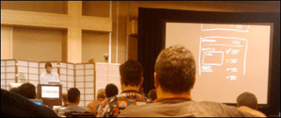
Photo by Nate Burgos
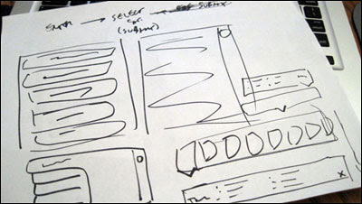
Nate: It was refreshing to see live digital sketching (above) to illustrate Singer’s lecture. With the black backdrop serving white and red strokes, I thought they were using their iPad app Draft but turned out to be a large canvas, perhaps Photoshop. The overhead projector has become more extinct. And starting a presentation with a relevant story is always a good method to gel all the key talking points, as long as the story is relevant, and even better when it has humor as Singer did in his telling.
In closure, when it comes to language, designers and developers work their native way of making something. Their respective languages can collide but they converge toward accomplishing a shared goal: a good product to help bring a good experience to people.
• • •
A version of this piece was published at the blog of custom software developer Pathfinder Development.

