1. How did you arrive at what you do as an Icon Designer?
As a product designer, I had to handle icons every day in the making of understandable and useful interfaces. Finding an appropriate icon is time-consuming, can be changed tons of times during the course of visual design. For these reasons, I turned to creating tailor-made icons purposely designed to fit a precise action for specific situations—an integral task here was gathering feedback from my teammates to help inform and refine the iconography.
2. Being the founder of Symbolikon and more symbols-based libraries, what were a few first steps/activities you took to start these projects?
The initial input/idea was determining an area of interest—unexplored in the icon-industry. This is the main road to take during the whole icon-product-development process. Once the road is in focus, I do a lot of research in order to define topics and categories. Research is crucial. It sets the stage for directing the entire collection while informing these steps: create a list of categories, understand what is to become the main category, figure out the features of each subcategory, along with determining common traits that each single icon should contain. These actions help contribute meaning and functionality throughout the whole icon-collection’s composition.
3. What icons are truly iconic to you? How do they reach the level of iconic?
An ‘iconic’ icon is a visual element that’s easy to remember. Sticks in your mind the first time you see it. There are many strong icons: shaped in relation to a specific object for describing action, imbued with meaning that’s one-way.
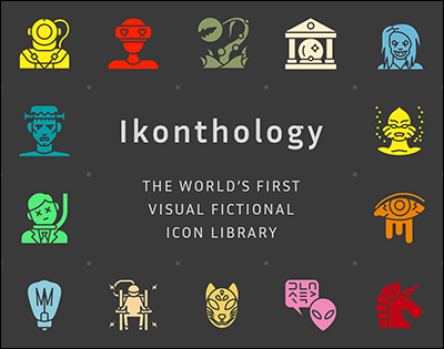
In one of my new Ikonthology compendiums, the “Extreme Horror” category is visibly iconic, because both objects and characters possess unmistakable graphic elements which can be readily perceived as simple and unique in their meanings.
4. Is there an icon-driven/inspired creation that you readily admire—What is it?
Regarding art, the public-facing images by …
Thanks for reading so far this Design Feast interview.
Read this full interview and more by supporting Design Feast on Patreon. If you’re able to, please become a Patron of Design Feast today from $1 and up—it only takes a minute. Your monthly contribution will give you full access to this interview and those upcoming with extraordinary creators and their perspectives. Stay both informed and inspired.

What will stay free to completely explore at Design Feast are the 346 insightful interviews with an incredible range of Designers, Bloggers, Makers and realizers of Side Projects.
Learn more about Ikonthology.